Tripadvisor

AI Travel Assistant
-
The AI Travel Assistant launched in late 2024, just before Tripadvisor’s 2025 brand refresh — meaning all original colors, components, and interactions needed to be re-evaluated and updated to align with the new design system.
The assistant is a cross-site AI chat experience that helps users ideate trips, ask questions, and save recommendations directly into their plans.
My role focused on defining the core user problems, shaping the end-to-end workflow, and partnering cross-functionally to ensure the experience was intuitive, on-brand, and genuinely useful throughout the planning journey.
-
Logged-Out User Engagement Gap Most users interacting with the FAB are not logged in, which leads to lower engagement and a steep drop-off in chat completion rates.
2. Unclear FAB Value Proposition Inside Chat Once users open the chat, Ollie’s purpose and benefits are not clearly communicated or reinforced, causing many users to lose interest before taking action.
3. Weak In-Chat Dynamic Prompts The prompts shown inside chat are less relevant and engaging compared to in-page prompts, resulting in fewer users starting or continuing conversations.
4. Device-Related Drop-Offs User drop-off rates are higher on certain devices—especially mobile—likely due to chat layout or usability challenges that disrupt the browsing experience.
5. Performance Varies by Page Type Engagement and completion rates fluctuate significantly depending on the type of page or entry point, suggesting inconsistent user value or experience across different site areas.
-
In-chat dynamic prompts are less effective than in-page prompts
(Supported by data)On destination pages, 70% of queries are initiated via prompts, while in FAB only 40% are.
Visibility and context appear to be stronger for in-page prompts, suggesting in-chat prompts may be less compelling or relevant.
High proportion of logged-out users is limiting engagement
(Supported by data)The FAB rollout is occurring in an environment where 85% of interacting users are logged out, versus 69% in the pre-test on destination pages.
Since logged-in users typically have higher engagement and completion rates, this shift in audience composition likely contributes to the lower overall conversion from FAB click to message sent.
Value proposition of FAB is not clear enough
(Partially proven)The CTR is low (0.24%) and once users open the chat, there’s a big drop off in messages sent (7.4%), indicating that many users do not see enough reason to engage or understand the FABs purpose.
The number of users who click on the sticky header (collapsed entry point) is twice the number of users who click on the FAB on destination pages. This suggests users may not be perceiving the value of the FAB.
Initial curiosity is driving early engagement, but not sustained use
(Likely, but needs further testing)51% of FAB interactions happen on first exposure, coinciding with the tooltip display.
This suggests the tooltip prompts curiosity-driven clicks, but without continued visibility or additional triggers, repeat interactions are limited.
To confirm this, we could test scenarios such as removing the tooltip, varying its design, or reintroducing attention triggers (e.g., periodic animations, reminders) and observing whether engagement beyond the first impression improves.
Servlet-level differences may be impacting results
(Partially supported, needs deeper analysis)Some servlets are not showing proportional growth in query initiations and message sends relative to impressions and clicks.
This may relate to differences in page intent, layout, or audience composition.
Device differences may also be impacting the results
(Partially supported, needs deeper analysis and more volume of data)Mobile web engagement is consistently lower than Desktop/Tablet web across all steps of the FAB funnel, except for FAB click.
This could have to do with the fact that the chat window takes up the full screen on Mobile web, unlike Desktop where travelers can continue to browse while they chat.
Step 1: Asses the original designs


Step 2: Define user and business problems
User problem 1: Unclear FAB Value Proposition Inside Chat
After opening the chat, users are not clearly informed of Ollie’s benefits or capabilities, leading many to lose interest and abandon the experience.
What others are doing


Potential Solutions
Solutions based on learnings
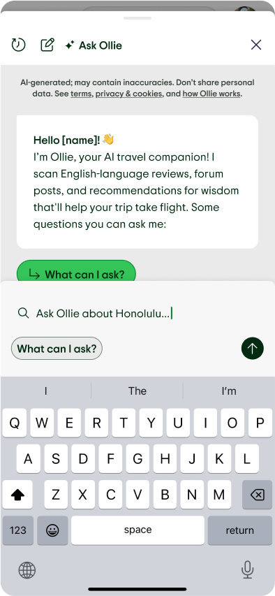
Let users preview and select questions before engaging via an educational and interactive “What can I ask Ollie?” modal. Competitive example here.
What we don’t know
1. What information or cues would make users more likely to explore or engage further?
2. What are users’ first impressions when they open Ollie?
3. Do users feel Ollie is trustworthy, useful, or relevant after opening chat?
Explorations
Let users ask AI chat what types of questions can be asked.


Problem 2: Weak In-Chat Dynamic Prompts
In-chat dynamic prompts are less relevant and engaging than in-page prompts, causing fewer users to start or continue conversations within the chat.
What others are doing


Potential Solutions
Solutions based learnings:
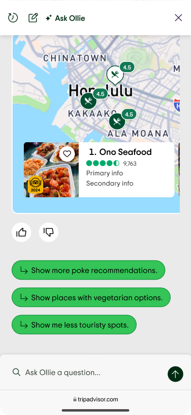
Stack prompts vertically so they’re visible without scrolling, and explore showing more than three to boost relevance.
What we don’t know yet:
1. Do users notice and read in-chat prompts, or do they ignore them?
2. What makes an in-chat prompt feel relevant or “worth clicking” to users?
Step 3: Ideate potential solutions
Explorations
Stack prompts vertically so that users will have at least 3 relevant options
to get started or continue the chat


Problem 3: High Device-Related Drop-Offs
Drop-off rates are higher on certain devices—especially mobile—due to chat layout or usability challenges that interrupt or complicate the browsing experience.
What the data says
While mobile users click the FAB at a rate approximately 50% higher than Desktop/Tablet users, they drop off at much higher rates at subsequent stages (selecting a prompt, entering free text, submitting a message).
This could have to do with the fact that the chat window takes up the full screen on Mobile web, unlike Desktop where travelers can continue to browse while they chat.
Potential Solutions
New chat UI on MW -
Replace the full-screen flyout with a bottom drawer chat window, allowing users to continue browsing and interacting with the site in the background.
What we don’t know yet:
1. Which aspect of the chat UI on mobile/tablet most disrupts or annoys users?
2. Do users want to chat and browse simultaneously, or do they expect/want a focused chat experience?
3. Are touch targets, load time, or text size contributing to drop-off?
Explorations


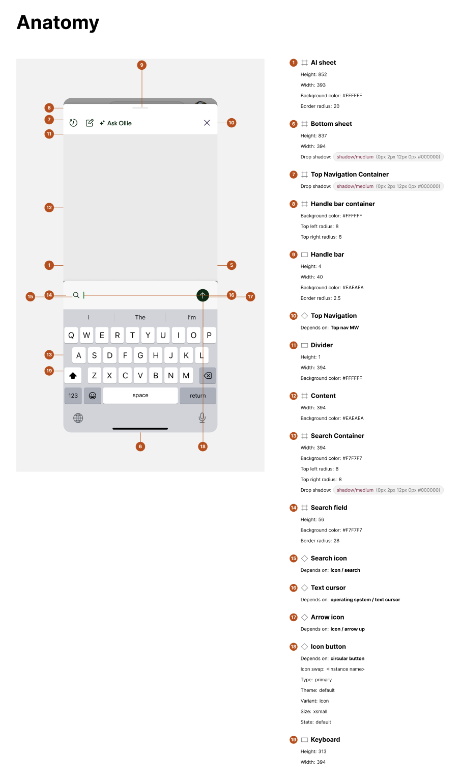
Step 4: Prep designs for eng
Finalize components in Figma.

Spec out Desktop and Mobile web for engineers.